Images and video help sell products. Textual content, though, is of the utmost importance. Visitors need to understand exactly what you?re asking them to buy, and they need to be talked with, not at.
When writing product descriptions, make sure you’re conveying exactly why someone would want to buy certain items. Consider the problems an item solves, or the value it provides. This process takes an understanding of your target buyers, research of their pain points, and knowing what entices them to pull out their wallets.
Here are six things to include in product descriptions, to convert more visitors into customers.
1. Speak in a language they understand. Unless you sell to only Rhodes scholars, write using simple terms everyone can understand. Word choice is sometimes a challenge, because you have to find a healthy balance so those who do have an understanding don?t feel like you?re talking down to them.
For example, Crutchfield, the electronics retailer, speaks to the masses. Its writers explain complicated features using words most anyone can understand.
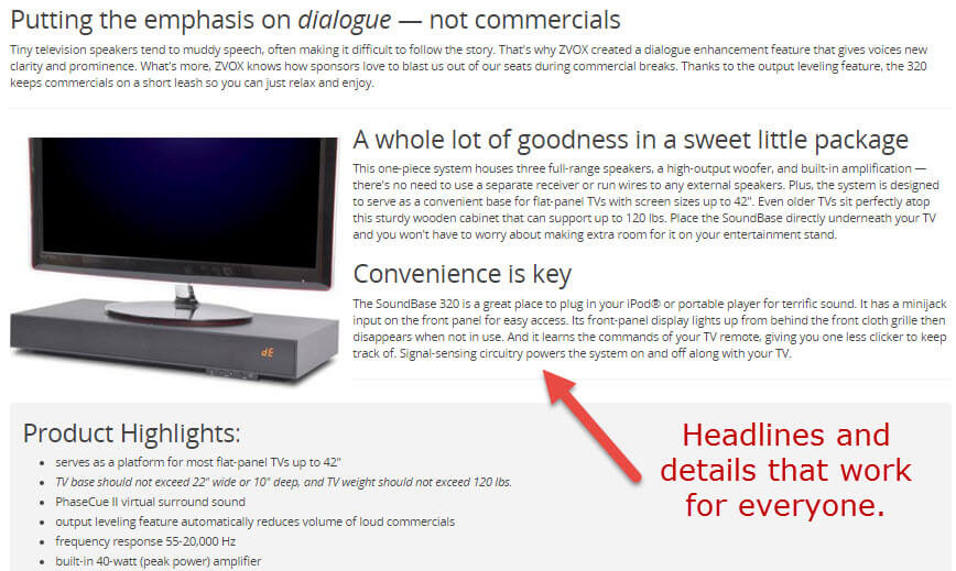
Crutchfield’s writers aim to reach a broad range of consumers.
2. Write the way your target audience wants to read. The Harry Potter books didn’t become popular solely due to the plot. Author J. K. Rowling’s writing style was what first caught everyone’s attention. Harry’s world is detailed and complex, yet the reader understands it. Your visitors should?understand what you’re saying, and the best way to ensure that happens is to write for them.
Don’t be afraid to inject a little humor. Groupon Goods’ product writers, for example, typically do an effective job at including both trigger words and humor. This voice is often carried through when answering questions as well.
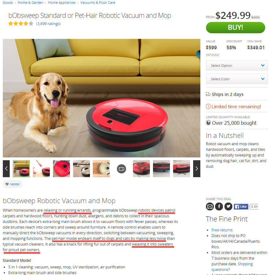
Groupon Goods’ product descriptions often include compelling?trigger words and a bit of humor.
3. Tell shoppers how the product helps them. What a product is or what it does seems logical. But what people actually need to know is how it will improve their lives or entertain them. This is why product specifications should often be placed at the bottom of a description, or in a separate tab.
The website for Scrub Daddy, the cleaning sponge, is a good example of how to solve people’s problems. The standard household sponge requires a lot of elbow grease; its lifespan is short. This sponge aims to conquer many issues, and the write-up conveys that.
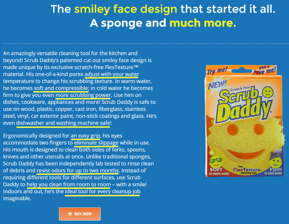
The original Scrub Daddy sponge aims to solve many issues, and the write-up conveys that.
Scrub Daddy’s description tells us that the product:
- Requires less work to use;
- Doesn’t slip out of your hands;
- Can be used on delicate items;
- Can help quickly remove baked-on food;
- Doesn’t get as stinky as typical sponges;
- Can be cleaned easily.
In two paragraphs, the company has addressed at least six pain points nearly everyone experiences. It’s no surprise this product sells like hotcakes.
4. Focus on them, not you. One of the biggest mistakes companies make is putting focus on a product or service rather than on the shopper.
Which one of these hypothetical statements is better?
- The Scrub Daddy is cute and works hard.
- You’ll smile and work less with the Scrub Daddy.
While both of these sentences say the same thing, the second one addresses the shopper, who is more easily convinced to purchase if the product requires less work on his part.
In short, make sure you shine the spotlight where it belongs.
5. Don’t be vague. Focus on words that make sense and ditch filler ? i.e., words used to add eloquence to the writing, or to fill space. Filler is wasteful because it makes readers stop for a moment. Stopping can translate to a page exit, which kills sales.
Amazon isn’t always the greatest at explaining products well, but the page for the Echo, the voice-activated electronic device, is scannable. Visitors can quickly see everything the device does and all the problems it solves. There’s no filler and reading just one or two bullet points is enough to get almost anyone to buy one.
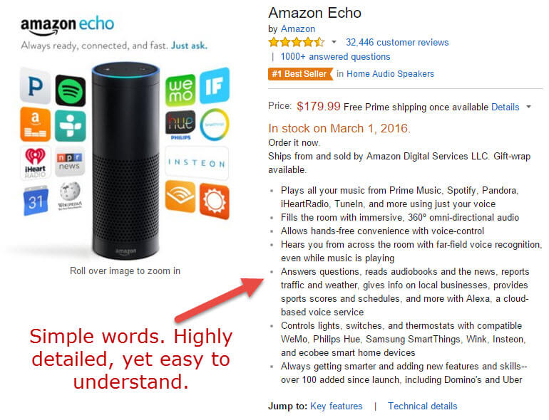
Amazon Echo’s product page explains quickly what the unit does and the problems it solves.
6. Provide real examples. Many product pages can benefit by listing examples of how items can be used. Unless the product was designed to solve a specific problem, use examples that apply to the largest number of people. Here’s one. Not everyone who wears an activity tracker is seeking to lose weight. Users of these devices may be training to run a race, or were directed by their doctor to walk more to either improve or maintain their health. Others may simply want to know how well they sleep. If you focus on just one primary need, you’ll lose the attention of those wanting to address other concerns.
Dyson, the vacuum cleaner, tackles six main concerns when describing the Dyson Ball Multi Floor vacuum. Using text and thumbnail images, the page addresses issues people may have with other vacuums: suction power, ability to clean, ability to reach small spaces, reactions to dust, versatility and ease of cleaning the unit itself.
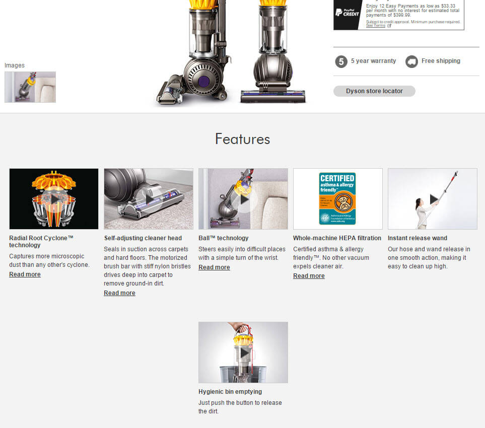
The Dyson Ball vacuum page addresses six main concerns people have with their existing cleaner.
If you aren’t sure about all the information you should be including in product descriptions, listen to what your visitors and customers are asking or saying. Questions and product reviews provide great guidance on not only what to say, but how to say it.


